Culture Buddies is a program allowing people attending a QPL event to be paired together to stay on after the event to assist each other with a language needs. It is geared towards anyone residing in broader New York City, who would like to attend at least one QPL event, has access to a computer/smartphone and an internet connection, and is willing to meet other members of their community to receive or give language-related assistance.
Definition of PIT
Culture Buddies is a public interest technology (PIT). Our definition of PIT is technology exclusively focused on improving the common good of the target community, without any commercial ends. Therefore, Culture Buddies focuses on Queens' diverse immigrant community by helping residents get assistance from each other after library events, creating a mutual aid network whilst allowing for community engagement, entirely free of cost and deprived of any corporate ends.
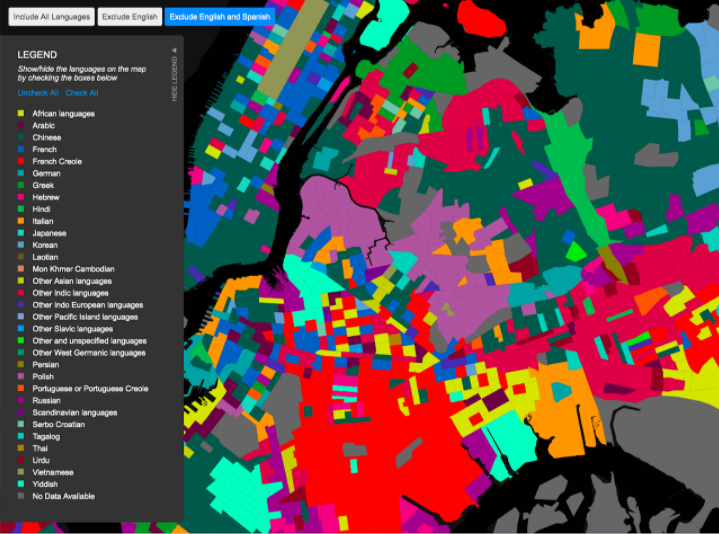
By studying a publicly available statistics detailing the language diversity and needs that exist within Queens, we learned:
- 49% of households in New York City speak a language that is not English;
- 138 languages are spoken in the Borough;
- 190 nationalities are represented in the Borough, making it the most diverse place on Earth;
- More than 55% of Queens’ population aged 5+ speaks a mother tongue other than English;
- The Borough has an extensive history of immigration and resettlement, dating back to the 17th Century. New immigration flows in the 20th Century in particular contributed to the current diversity;
From this data, we were better able to understand the geographical distribution of these subpopulations, which gave us some insights into distributions which may be important for our project and allowed us to understand if we were leaving out important perspectives (PIT Question HW4).
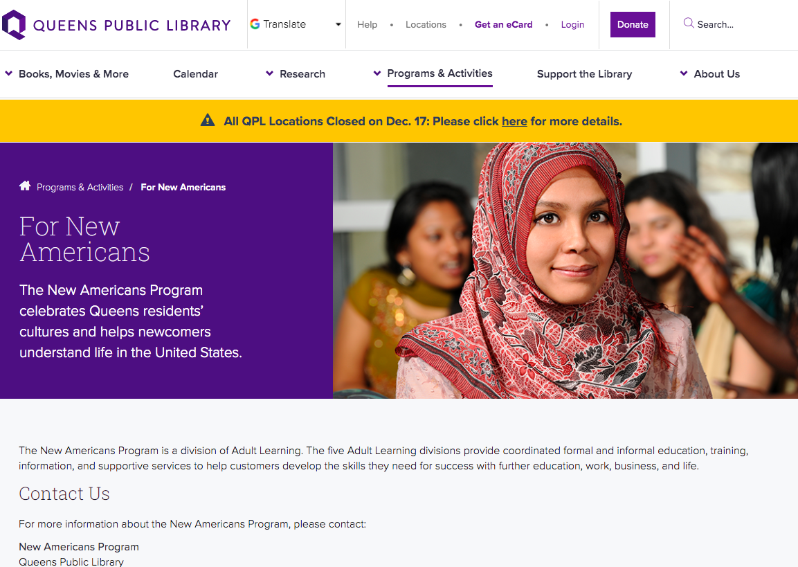
We then researched the language services offered by the Queens Public Library, which include:
- English for Speakers of Other Languages classes
- Coping skills workshops in several languages on immigration law, tenants’ rights, the American educational system, parenting skills, health issues, job training and domestic violence
- Cultural arts programs, ranging from monthly programs through the Culture Bridge program (e.g. introduction to Jamaica and reggae), to smaller events (e.g. Chinese literature and critical reading) for particular library patrons
- The International Research Center, located in Flushing, dedicated to special collections of international authors and books
With this in mind, we wanted to have a broad idea of solutions that already existed, to draw inspiration from and avoid designing a project that already exists. We identified two broad categories:
- At the macro-level, Executive Order No. 120 (which required all civic/city-service agencies to be translatable into 170 supported dialects via telecommunications services) and Local Law 30 (which requires all city agencies to distribute documents into 10 designated languages) were the two biggest official policies adopted by the City of New York. To verify the extent to which these policies were put in effect, we measured the number of languages available on NYC websites
- At the meso- and micro-level, hundreds of projects and technologies created by individual actors (e.g. the Queens Public Library, nongovernmental organizations, activists, or even corporations) already existed and contributed to alleviating language barriers. We in particular documented 3 existing public interest technologies seeking to address language barriers in New York (Transparent Language Online, the QPL’s website as a language aggregator, and Cell-Ed), and delved into the QPL’s language services.
At this stage, we had a general idea of the overarching challenge of language barriers through compiled statistics, and some of the services that already existed that sought to address it. We thus began to amplify our findings by seeking individual testimonies, whilst being careful of the PIT question “Is there an existing bias in the research?”. We recognized that, at this stage, we had to interview as many people as possible, from any background or age. Due to the Covid-19 pandemic and the restrictions that were imposed because of it, there was already biases in our research: we conducted most interviews remotely (by Zoom or by phone), thus 1) relied on personal networks to reach out to potential participants instead of having a random sample of interviewees, and 2) could only interview people who themselves had a phone or a way to conduct a remote interview. In an ideal world, we would have been able to place calls for interviews in QPL branches, or even conduct informal interviews with random patrons at a particular location. Nonetheless, we attempted to mitigate our biases by organizing some in-person interviews, and physically obtaining spatial information.


The insights we garnered from these first interviews were the following:
Librarians:
- Librarians all recognized the challenge of English for many communities and Queens, and were aware that many of them come to the QPL seeking language-related services (particularly ESOL classes and translation services);
- People who may not speak English well who come to the library often rely on bilingual library staff to translate;
- Librarians sometimes use Google translate if there are no bilingual library staff available;
- People “tend to look for both first language and English materials for respective children or even if they are participating in a library's English classes”;
- This tends to happen more when parents are by themselves because they often have their children translate for them or sometimes call relatives on the phone for translation assistance;
First- and second-generation immigrants:
- People are not aware of the laws, and consequently, their rights;
- First-generation immigrants often rely on their children to translate official documents or navigate important/complex processes;
- Library access is “limited” for people that do not speak English;
- Second-generation immigrants often bear the burden of translating for their parents from an early age;
- Even when resources are available at libraries, immigrant parents still rely on their children for translation support;
- There is a lack of cross-generational engagement at libraries;
- There are few resources for second-generation immigrants to learn their mother tongue;
Here is an example of a persona we designed and a user journey map, for two of the interviewees we had the chance to discuss with:
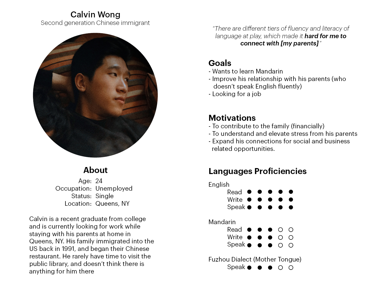
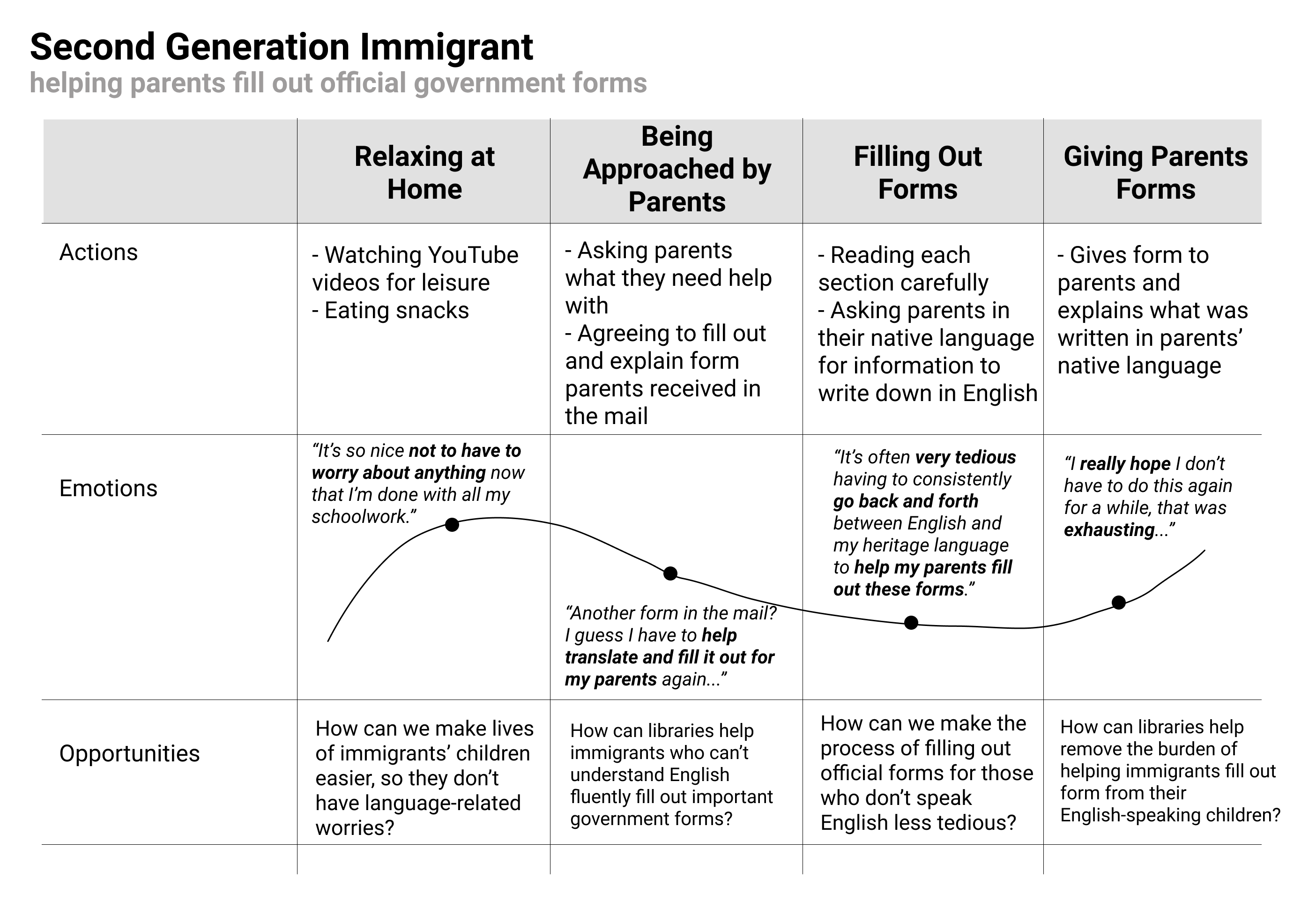
The public interest technology question that recurrently appeared during this first research phase was “Who is being included or excluded?”. We previously mentioned that bias was an inevitable component of our project because of research methodologies and exogenous circumstances. In addition to that bias, we realized that language barriers are not restricted to one particular population, but is present for people who, for instance:
- May be wealthy, or impoverished;
- Could be a teenager, a mother of four, or a first generation grandfather;
- May have just arrived in Queens, or have lived there for a long time;
- May or may not know how to use language tools like a computer or Google Translate;
- May or may not have access to the Queens’ Public Library or its services;
- May or may not know about particular services offered either at the QPL or elsewhere;
- May or may not have an Internet connection;
During our interviews, we realized that whatever project we ended up designing, we would inevitably include certain populations, and exclude others. Whilst it was a difficult realization (as we all took on this project with the goal of helping as many as we can), once we began working with this barrier in mind, we not only better tailored our interviews to try and understand our participants’ capacity to potentially be part of our project, but also critically thought about how best we could bring a technology forward, even if only to certain people.
After analysing the insights garnered in the research process, the first step we took to narrow down the field we wanted to focus on was to select the main themes of needs and opportunities that arose from our research and find previous solutions that attempted to address these gaps.
We realized that the library and the New Americans Program had already put lots of effort trying to provide accessibility for low income families, developing programs to assist inmigration issues and providing language services through platforms such as Language Line or Travis Touch, for example.
Although the variety and diversity of events and cultural activities offered at the QPL is rich and varied, we detected that it was necessary to put more effort in the integration of culture within language services, bridging the intergenerational gap and improving the outreach strategies about the existing services.
Some of the evidences that helped us define the focus of our work are the following emotions expressed by the community:
"The gap between generations is becoming bigger and bigger because children speak English at school, and when they come home, they go upstairs and do not talk to their parents because [their parents] do not speak English, and that is very sad."
Lu (1st gen, Chinese)
"It was really difficult when I was growing up. When going to to school and the world is in English, and going home and speaking Fuzhounese there only. My mom has better English skills... But for my dad, the only way we communicate is through Fuzhounese. My grandmother only speaks Fuzhounese and is illiterate."
Alex (2nd gen, Chinese)
We understood that the integration of culture within the programs offered at QPL was a key factor that would promote not only intergenerational exchanges at the library, but also among different communities, and also will prevent community isolation. Additionally, we wanted to find a way in which we could also provide a more effective way of reaching the community while offering them the possibility to suggest events and activities. Therefore, the questions that guided the next steps of our work were the following ones:
- How might we simultaneously integrate immigrants into local culture and civic culture while preserving and sharing their own?
- How might we enable specific communities to propose an event and simultaneously communicate and facilitate participation?
- How might we reduce the intergenerational gap between first- and second-generation immigrants?
During the ideation process we came up with a flood of ideas on how to address each of our questions, and elaborated mindmaps to organize them:
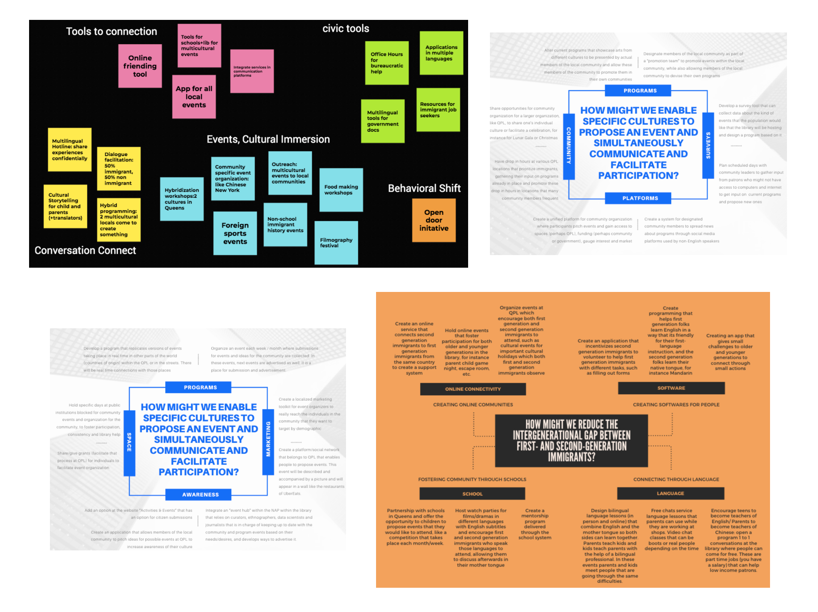
The next step of the process was to narrow down to 5 ideas for each of the questions we wanted to address. After narrowing down to 5 ideas, the most interesting ones we had were:
In an attempt to integrate immigrants into local culture and civic culture while preserving and sharing their own, we ideated the tandem platform, an application where people could offer their help for bureaucracy and immigrants can offer language lessons.
To enable specific communities to propose an event and simultaneously communicate and facilitate participation we thought of an application for event submissions and advertising that would look like Uber Eats but for events, partnering with the New Americans Program.
Finally, we detected that the third HMW, addressing the intergenerational gap, could be solved by the integration of culture in the first question, and that we could combine the two most exciting ideas to produce a more complete and sophisticated solution. During the process, the most important question that influenced our design has been how we can develop a tool that can touch on multiple generations and address larger societal issues without leaving any vulnerable groups behind.
While synthesizing our research and progressing through the ideation process, we placed a lot of consideration on the question, “What facets of the larger problem are being overlooked?” First, we recognized that our two ideas required Internet access, which excluded many parts of the community who may not necessarily have access to it. Additionally, we noted that when doing community outreach, it is difficult to reach many populations because the people doing outreach don’t always know the best ways to reach the communities they are trying to reach while making members of those communities feel comfortable and willing to interact, especially if they are not part of those communities themselves. With these facets of the larger problem in mind, we tried to think of strategies that could connect our project to the physical world in order to come up with a public interest solution.
Through prototyping, our biggest goal was simplifying design over several rounds of iterations: low-fidelity, medium-fidelity, and two high-fidelity prototypes.
We had multiple low fidelity prototypes to begin with, including a database of activity providers for QPL, a tandem mutual-aid platform, an event-organizing app for the community, and a localized marketing toolkit.
Low-fidelity prototype #1: the Culture Bridge Platform, a database of activity providers for QPL.
We came up with this prototype after a conversation with Yang Zing, the QPL Flushing Branch Director, who told us about Culture Bridge Program:
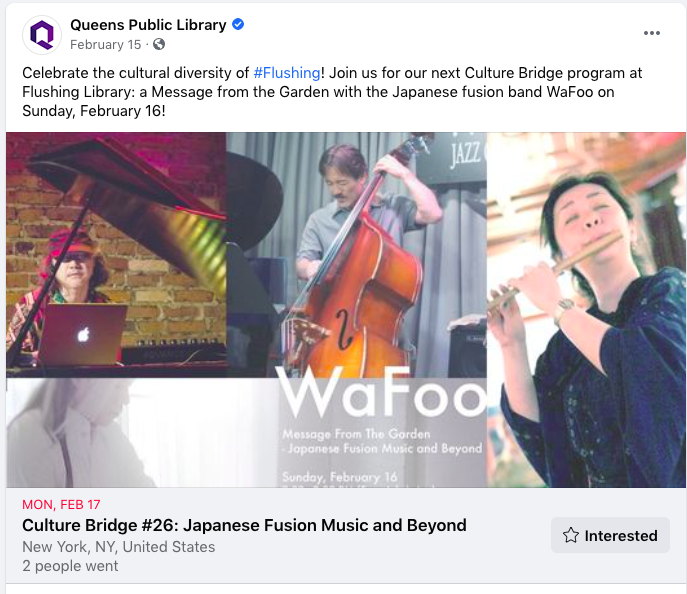
The Culture Bridge program is an officialization/standardization of the cultural events initiative of the Queens Library Flushing Branch. Its components include:
- Program Flyer is bilingual
- Presenters explain a little bit about the culture
- MC is multilingual
- Program is a culture education program
- 2-3 years ago was launched ⇒ cover as many cultures as we can (dependent on budget, they change cultures every year)
- Last year: Jamaica (promoted reggae artists)
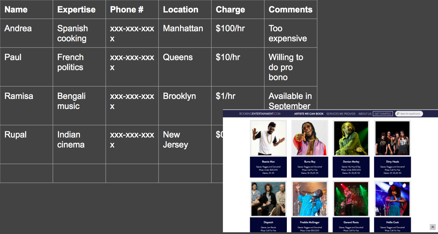
Biggest pain: finding performers and artists
Through this engagement, we decided to implement the Culture Bridge Platform, which at the moment was a database to help find performers and artists for cultural events at the QPL, which would allow members of the community to share their culture and perform in different languages.
Low-fidelity prototype #2: the Tandem Mutual Aid Platform
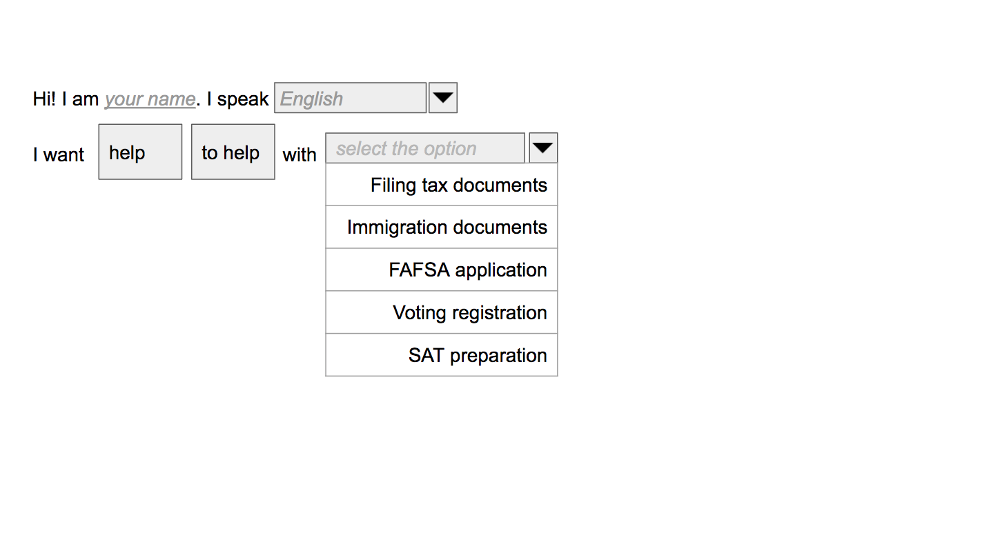
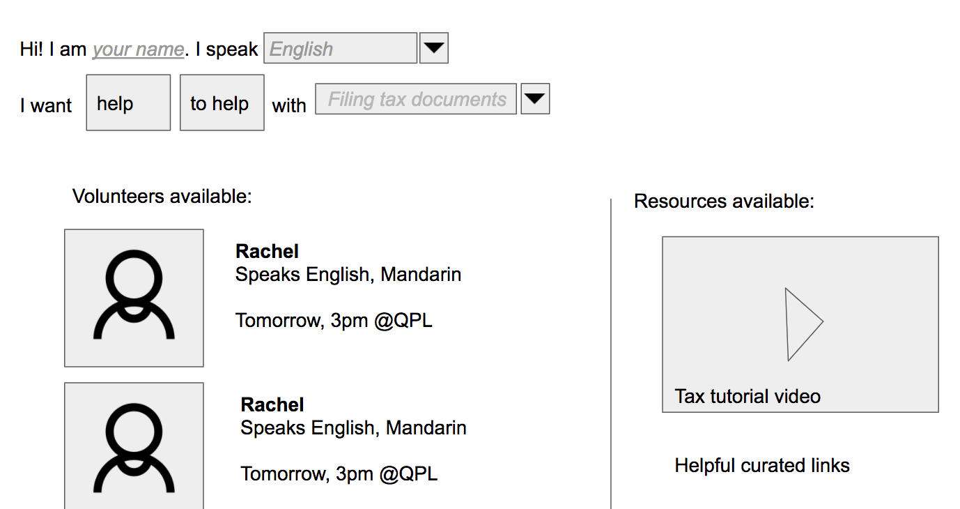
Tandem mutual aid platform: a platform where people can offer their help and get help, such as getting help with filling out government documents or with language learning. We decided to create a prototype for this idea because much of the engagement we had with various first- and second-generation immigrants centered around the difficulty of doing tasks for non-English-speakers that involved complicated language and the burden that is placed on many second-generation immigrants of serving as translators for their parents:
- Joseph: parents have a harder time with data as they do speak only Spanish
- Sandra: filled out forms for parents because they did not know Bengali
- Alex: "I have helped my mom fill in government and tax documents."
- Evelina: “I had to take on the role of translator for my mother and father. This meant that at young ages, I would have to look at extremely complicated governmental documents and state mandated documents for both my parents and myself”
PIT Considerations: We asked ourselves, "Have we identified the questions and risks most relevant to the chosen technology?". For this tandem mutual aid platform, we asked ourselves, How do we keep the platform very simple and user friendly? How do we incentivize people to volunteer their time? How do we make sure that there are no fake requests/volunteer profiles? What do we scope it to? How do we not burden the library and its staff in making this facilitation happen? These questions helped later guide our design decisions.
Low-fidelity prototype #3: Events App, create and submit events
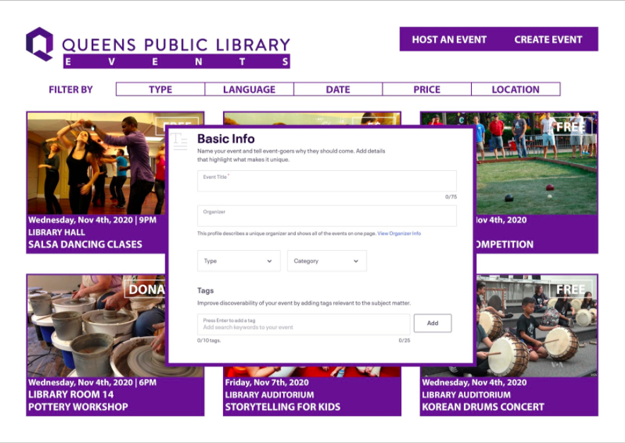
Prototype is an events app that would allow individuals and collectives to create and submit an event. The app was also intended to help to find performers, instructors or any other thing needed for the realization of the event. The app would allow local businesses to advertise their places as potential locations where to host the events, with the local businesses obtaining visibility in exchange. We decided to go with this prototype because during our research phase, we observed that there is not a place to advertise QPL’s New Americans Program’s Cultural Programs, and there is not a tool that helps people and communities to propose event ideas to the library, showing a lack of agency.
PIT Considerations: Again, we evaluated some of the risks that accompanied this events app, which included risks on both the institutional side (the library’s side) and the user side. Some of the risks on the institutional side were that the library could reject to do “extra work”, such as approving and moderating additional events, and that they could also reject the idea of advertising of other events that take place outside the library, especially at local businesses. Some of the risks we assessed on the user side included the facts that people not comfortable using applications will have a barrier, and the “approval” requirement may force the library to develop policies related to its criteria, since some users may feel “unfairly rejected”. Again, we used these risks to help guide our future design decisions.
Low-fidelity prototype #4: Localized Marketing Toolkit
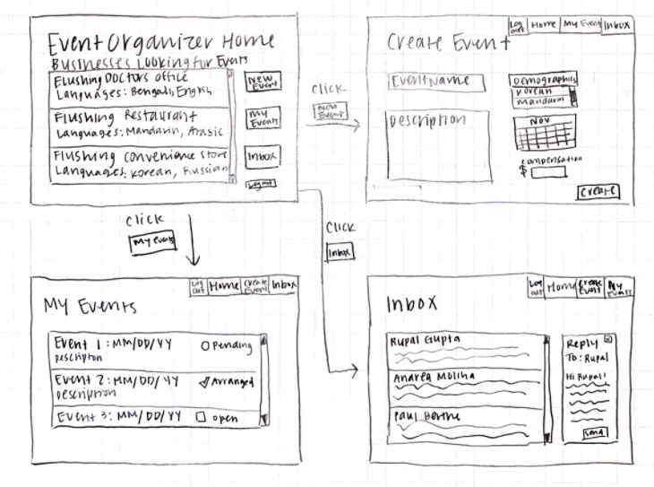
Localized marketing toolkit which allows event organizers to market events that benefit Queens' communities. It allows local essential and non-essential businesses to sign up to promote an event, getting compensated in return. We created the prototype because Organizers are often not integrated in the communities they are aiming to reach. When organizers do try to tap into these communities and are somewhat successful, they often are only able to capture one specific demographic of the community and miss out on advertising their events to members of the community who would still benefit from these events, but are more difficult to get into contact with.
PIT Considerations: Some of the questions and risks we identified relating to this localized marketing toolkit were: How will we get local businesses to use the app in the first place? How much compensation must we give to local businesses? How will we measure success in event recruitment by local businesses? How will we allow event participants to suggest their own events? How will we allow event participants to give feedback on events? We kept these questions in mind when moving forward with the prototyping stage and deciding on a single prototype.
Moving forward
Despite having four low-fidelity prototypes, we eventually decided to combine the events app with the tandem platform as well as integrating the database of activity providers after getting feedback to do so, as there was co-existing synergy between getting help/offering help to the community and creating community participation in events.
Iteration One
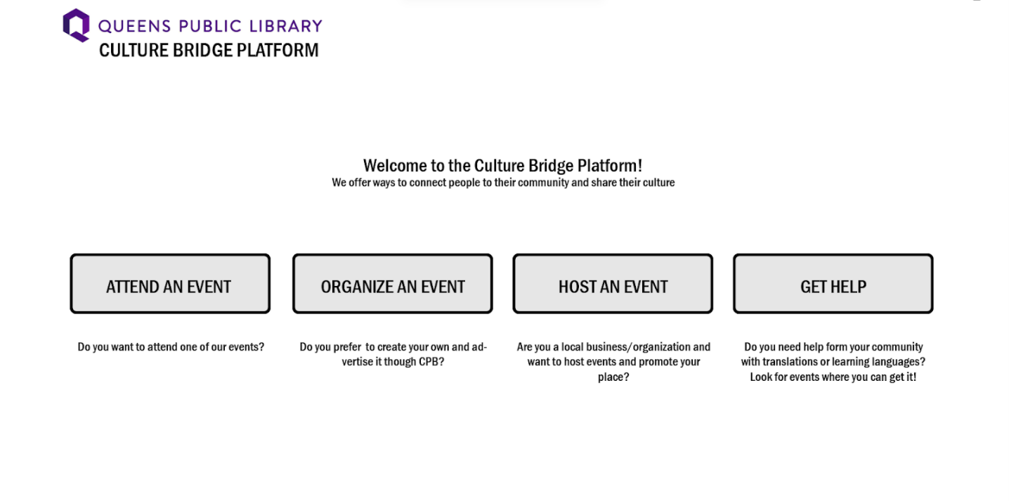
For our medium-fidelity prototypes, we tried to combine some of our ideas into an “events” platform. As you can see at the first page, for our medium-fidelity prototype, users could do multiple things, i.e. attend events (i.e. attend the events that QPL is already organizing), organize events (i.e. create own event using community space like the library), host events (i.e. community centers and businesses offer their space for events), and get help (i.e. users get help before/after an event from community members).
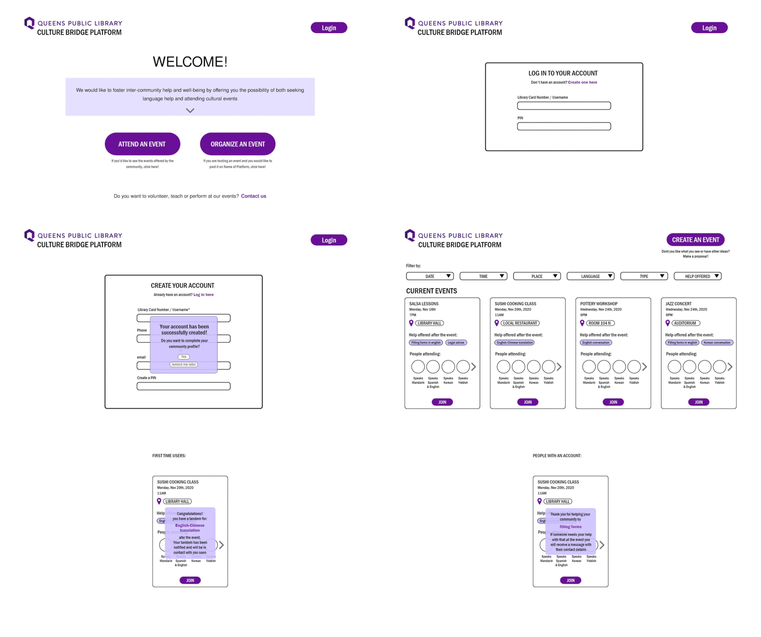
We got the feedback that too much was going on, so we simplified our design to two core functions: organize events or get help at event. Moreover, we realized that setting up "host event" option in community spaces needed a trust audit method so the event put up on QPL website is at least deemed safe to go to. We decided to push this functionality to V2.
PIT Considerations
Users validated our ideas, but were concerned that too much going on, and the goal of the platform was unclear and confusing, which was the biggest risk of our design. While the interactions were intuitive, we learnt that users did not like reading the army of text on the home page, so we had to think about a succinct way of communicating the idea. We also got the feedback that the “JOIN” as a call to action was vague and unclear. The idea that users found most compelling was "getting help at events", so instead of laying ourselves too thin, we decided to prioritize the journey of getting help before/after events, as a means of creating a community mutual aid-network, while enabling community participation, and iterated over the Mid-fidelity prototype on the design stage.
This platform allows Queens residents to get assistance from their fellow community members before or after an event held at the QPL.
First, we changed the homepage to have only one call, instead of two. Additionally, on the event page, we replaced the "Join" button with "Get Help" and "Offer Help"; "Create an Event" with "Submit a Proposal", and decided to show volunteers' languages instead of names.
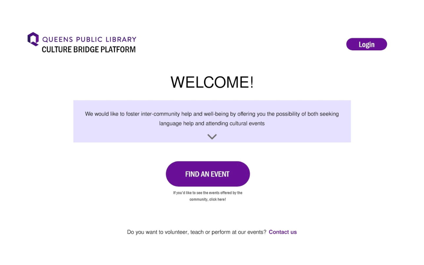
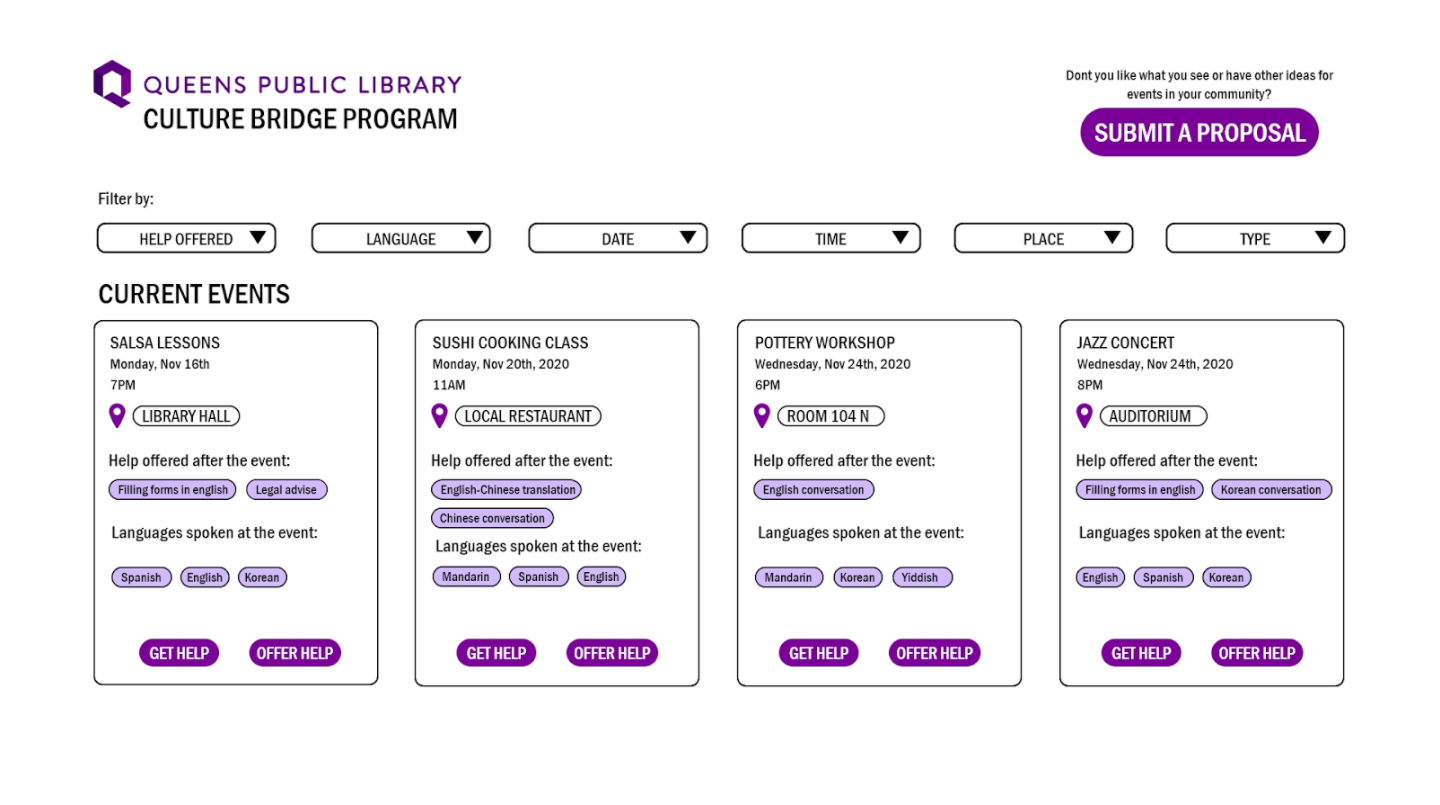
While the interactions were intuitive, we learnt that some users still had issues understanding what the platform was doing. Some thought language translation services were available for the events. We also learnt that “Get Help” and “Offer Help” did not sound sincere, and chose to pivot to “Find Buddy” and “Be Buddy”.
We made the interactions and the design on the technical prototype match that of the high-fidelity #1.
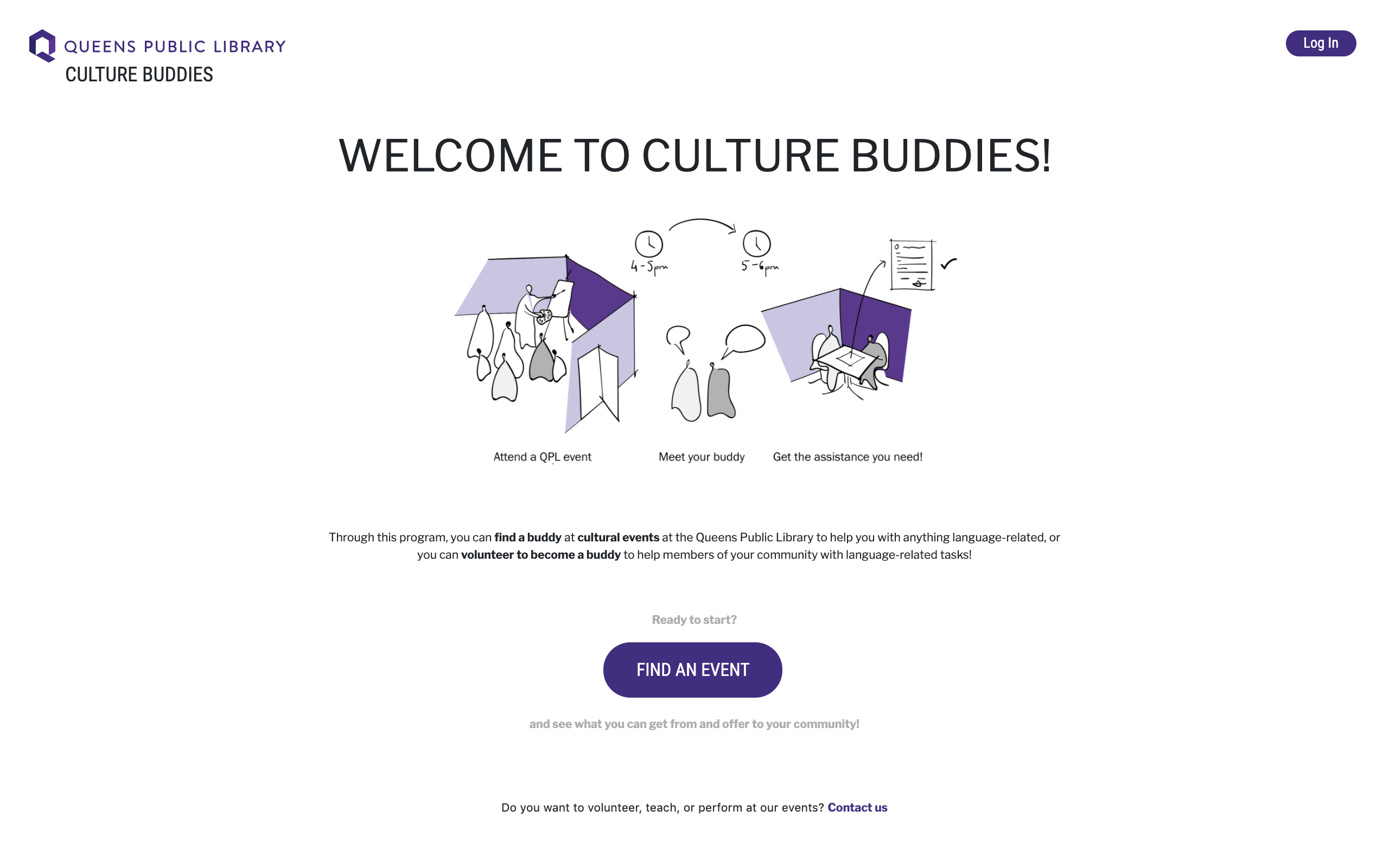
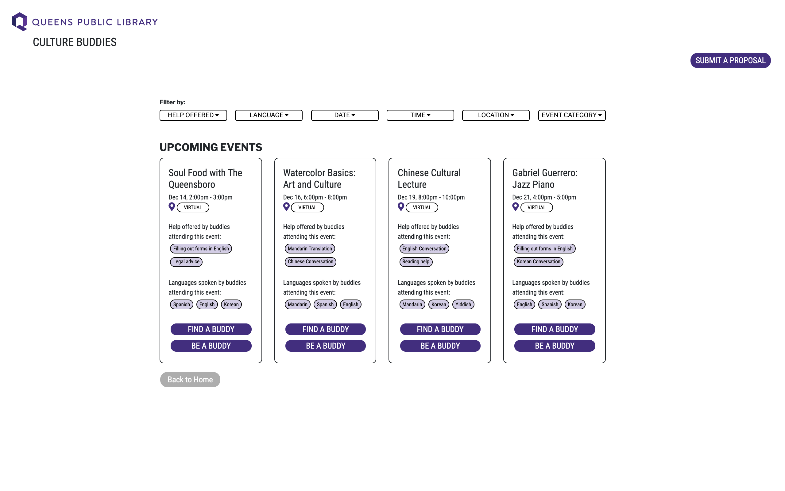
Based on the feedback from this, we changed the “Get Help/Offer Help” to “Find Buddy/Be Buddy”. We also made the home-page less text-heavy, more intuitive, and changed the name of the program to "Culture Buddies".
PIT Considerations and Next Steps
As we developed our high-fidelity prototypes, we continued to assess risks associated with our prototypes. First, we asked ourselves, “Have we identified the questions and risks most relevant to this population?” We followed this up with more questions: How are we going to promote the platform? How will we translate the platform in other languages? How will the platform be accessible for less tech-savvy users? We need a strong initial user base for the tandem to work, so we had a call with Nick Buron, the Chief Librarian, to discuss the promotion of the platform in the QPL marketing ecosystem. However, we were unable to address the other questions and plan to find ways to translate the platform into other languages and make the platform more accessible for less tech-savvy users in future iterations.
As we were designing specifically for QPL and the communities that it serves, the visual language to keep at its heart the diversity of Queens community through various forms.
 Color Palette
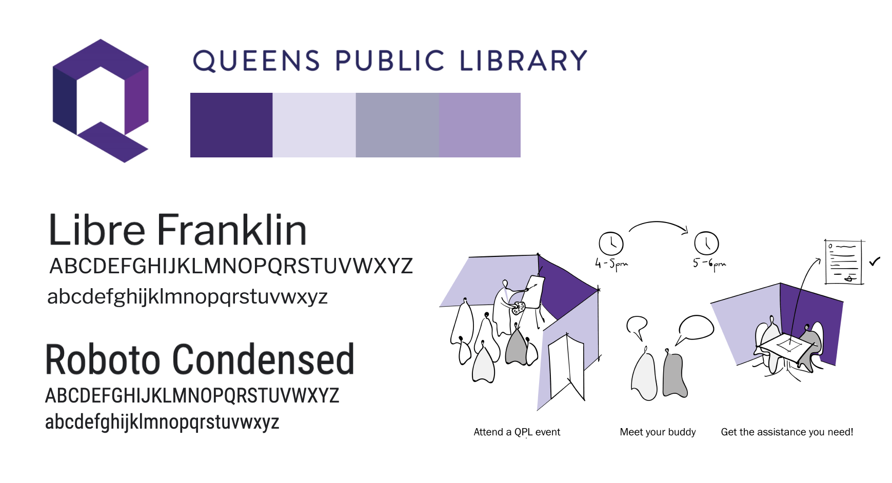
 We utilized QPL’s website and logo’s color palette, utilizing shades of purple, black and white, as seen in the high- and medium-fidelity iterations of our prototype.
During our research, we found that “QPL’s main color is now purple, a color associated with some of the qualities QPL seeks to cultivate, such as wisdom, creativity, dignity, and ambition, and a secondary palette of colors highlights the vibrancy and diversity of the public the Library serves.”
TypographyWe used sans serif fonts throughout our prototype. We chose to use sans serif rather than serif because we wanted to be associated with the feelings of casual, informal, friendly, and very approachable rather than traditional, established and trustworthy. It is, after all, a platform for Queens residents to find buddies and offer to be buddies.
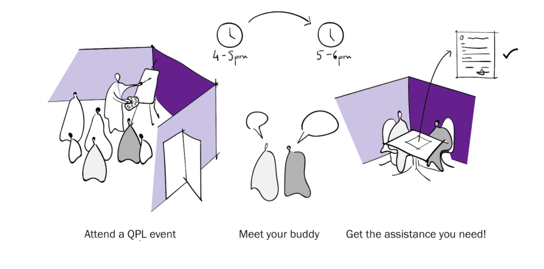
Graphic: We used some iconography to explain the concept of our Culture Buddy program that is accessible through a visual, eliminating the need to read long sentences. This effort makes absolutely clear that the diverse communities was to make it clear to the target audience what the platform was about
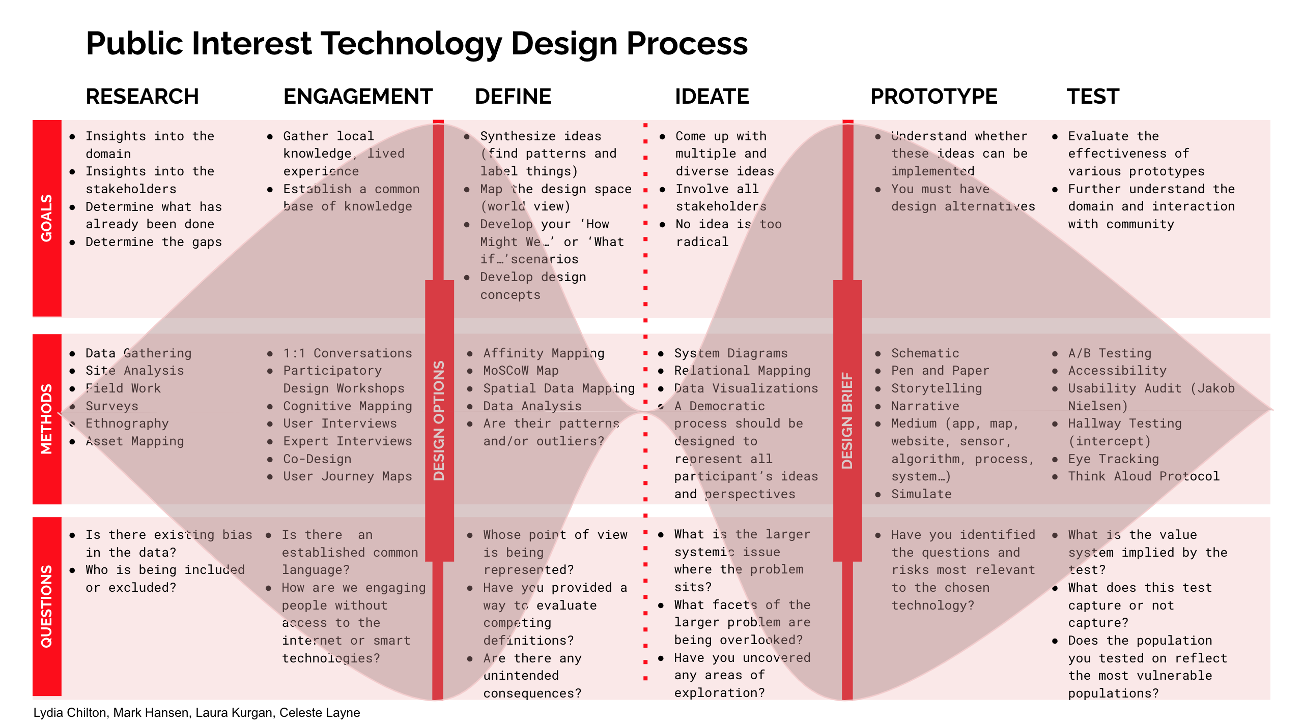
Throughout each prototyping stage, we tested each prototype on many different users to evaluate the effectiveness of each of the prototypes and further understand the domain and interaction with the community, as highlighted in the PIT double diamond design process.
After creating our four initial low-fidelity prototypes, a database of activity providers for QPL, a tandem mutual-aid platform, an event-organizing app for the community, and a localized marketing toolkit, based on feedback we received from instructors and classmates, we decided to merge these prototypes to end up with only two prototypes: the Culture Bridge Platform and the Tandem Platform and Events Management System. These merged prototypes were then tested on target users, particularly first- and second-generation immigrants, for usability.
Much of the feedback for the mid-fidelity Culture Bridge Platform prototype criticized the prototype’s lack of understandability or intuitiveness; most users that we tested on were unable to understand what the purpose of the Culture Bridge Platform was. Some important feedback from these tests is highlighted below:
“I don't understand well how I can find help. I would like to find help without going to an event.”
Ana (1st gen, Spanish)
“You need a better description at the front site, so people understand that it is not just about events, but that is building community and offering social help.”
Tianyu (1st gen, Chinese)
This feedback greatly helped influence our design, as we learned that while the purpose of our program might be clear to us, the people who designed it, it may not always be clear to others.
During this round of testing, we also tested our second combined prototype, the Tandem Platform and Events Management System. Like the Culture Bridge Platform, we conducted usability testing on first- and second-generation immigrants who we were able to contact easily, many of whom were close in age and background to us.
The testing results we received for the Tandem Platform and Events Management System revealed a similar issue as to the main issue we experienced with the Culture Bridge Program--a lack of clarity. For this prototype, much of the criticism received from users we tested on related to the presence of terms or wording that was unclear:
“You need to more clearly define what things are, like compensation and what event status symbols mean.”
Sandra (2nd gen, Bengali)
“It’s not clear what exactly an event organizer or activity provider / facilitator is.”
Amy (2nd gen, Chinese)
Like the Culture Bridge Platform, after testing the Tandem Platform and Events Marketing Toolkit, we learned that we cannot assume the user will always understand the language or wording of our program.
One of the PIT questions that we strongly considered after reflecting on our feedback for this round of testing was “Does the population you tested on reflect the most vulnerable populations?” To that, we answered NO. While many of the users we tested come from low-income areas and include target first- and second- generation immigrants, they also were mostly all college-educated, had access to the Internet, and were able to get through some testing on a simple video or phone call. Some of the most vulnerable populations that we’re designing for are from low-income communities that don’t have access to the Internet and may not have a college education. Additionally, all of the people we tested our prototypes on were in a similar age range to us, so we failed to include older users who may not be as technologically-savvy in our testing of our medium-fidelity prototypes. Because of this, we had to refer back to our research to think about possible issues that vulnerable populations may run into while using our program.
The feedback we received from our first round of user testing in tandem with our reflections on our lack of testing on the most vulnerable populations greatly helped influence our design decisions, as in the next iteration, we focused on optimizing our prototype to be simpler, clearer, and easier to understand, both in terms of the program’s objective and the language used in the program, the latter of which is extremely important because some of our targeted users are non-English-speaking immigrants.
Taking this feedback and research into consideration, we decided to combine the Culture Bridge Platform and the Tandem Platform and simplified the program to only include the actions of “Attend an Event” and “Organize an Event,” removing “Host an Event” and “Get Help” as having additional actions confused users, especially since the title descriptors were not clear for the latter two. We also decided to include a short explanation of what the Culture Bridge Platform is meant to accomplish.


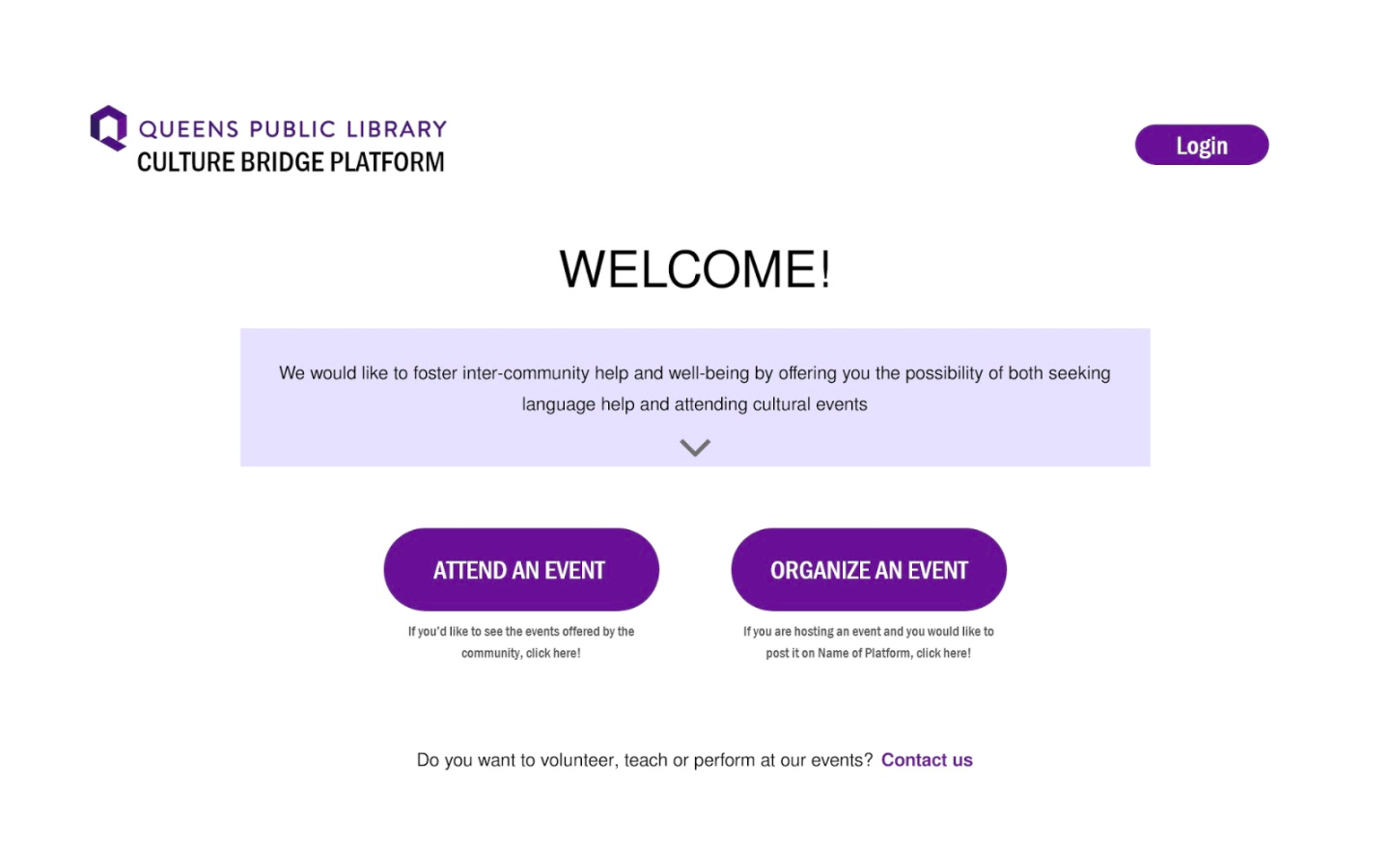
Before testing our next medium-fidelity prototypes, we received feedback from instructors and classmates that suggested that our program is still too complicated. We realized that our goal for the scope of this class was to create a functional prototype that does one thing well, and we decided that we wanted to focus on building our prototype to center around the “Attend an Event” interaction, where people who need language-related assistance can be matched with those offering such assistance while granting the ability to attend a cultural event at QPL.


At this stage, we realized that while we took into consideration the fact that the purpose of the Culture Bridge Platform was not easily understood, we failed to account for some of the areas we could improve our program based on our reflections of the PIT question, particularly the inaccessible language used throughout the program. Thus, we adapted the introductory text on the landing page to use more accessible language and changed the title of the program from “Culture Bridge Platform” to “Culture Buddies.”


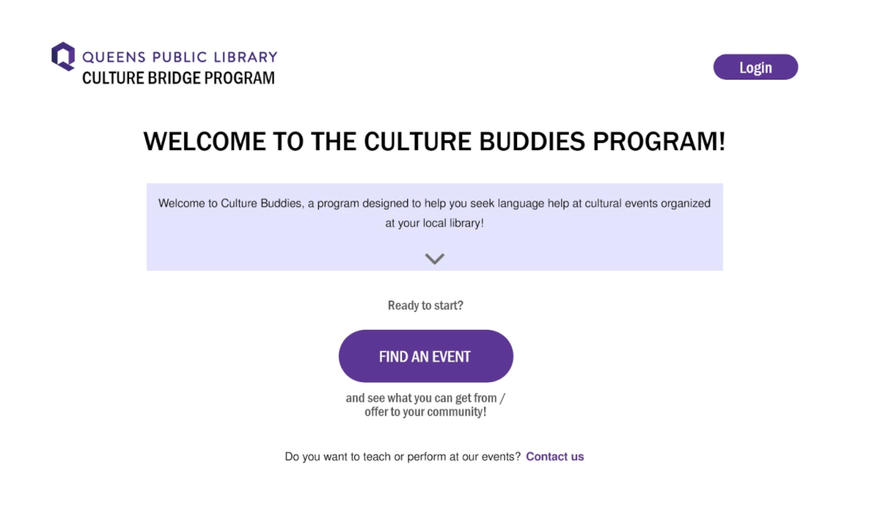
We then tested our updated design prototype on several users similar to the users that we had tested our prototypes on previously. We received a lot of positive feedback, such as the interface being clean and visually appealing, but most of the criticism we received once again centered around the lack of clarity in our language and difficulty understanding the purpose of the Culture Buddies program. Users specifically pointed out issues with the explanatory text on the landing page and the “Get Help” and “Offer Help” buttons on the events page:
“The welcome message is confusing and does not explain the concept well.”
“‘Get help’ is very misleading, as I assume it means getting help navigating the website. I’d write something like ‘volunteer help’ instead.”
Maty (2nd gen immigrant)
“Confused about what the platform does exactly.”
Jules (expatriate)
During our second round of testing, we also tested our technical prototype. Some of the risk questions we assessed based on prior feedback and testing include: What does the platform do? What do “get help” and “offer help” mean? Are interactions easy to understand/follow? We received similar criticism on the technical prototype as we did with the medium-fidelity design prototype:
“The functionality of the platform was unclear.”
Amy (2nd gen, Chinese)
“I'm confused by the ‘help’ in ‘get help’ and ‘offer help’.”
Seyun (1st gen, Korean)
“Home page: text too long! People do not like reading!”
Pranava (bilingual, South Asian teen)
“Thought that ‘get help’ was basically translating the event from its language of delivery to the selected language!”
Anju (bilingual, South Asian 40 y/o)
We returned to the question, “Does the population you tested reflect the most vulnerable populations?” Our answer was once again NO. Although we did test on some first- and second-generation immigrants as we did in our previous round of testing, we were once again unable to reach the most vulnerable populations. Since most of our group is not currently located in the NYC area, most of the people we tested our prototypes on were people who don’t live in New York, who would then never use the Culture Buddies program. We did test on one user who is older and not technologically fluent, but the rest of the users we tested on were decently comfortable using technology. However, although we tried our best to make our testing population more reflective of the most vulnerable populations, restraints such as physical location and COVID-19 made it very difficult for us to seek out and contact these users to participate in our tests. In future iterations, we hope to test on these more vulnerable populations.
Reflecting on this again, we made our goal for the next iteration to combat the Culture Buddies program’s inaccessible language and unclear purpose. These influenced the next major design decisions we made in our final (for now) prototype. First, we added a visual to the landing page that illustrates how the Culture Buddies program works, removing the long textual explanation of the program and adding a short, simple sentence below the illustration to complement it. By doing this, we hoped to not only make the purpose of Culture Buddies clearer, but we also hoped to make it easier for non-English speakers to comprehend as visuals can be more easily understood than text by those with limited English proficiency.


Finally, based on the feedback, we decided to change “Get Help” and “Offer Help” to be more clear and consistent with our title: Culture Buddies. We changed “Get Help” into “Find a Buddy,” while changing “Offer Help” into “Become a Buddy.” We also changed the language used to describe the rest of the buddy-related event details, such as the languages spoken by buddies attending the event and the language-related help offered by buddies attending the event to make it easier and clearer to understand.


Here is a walkthrough of our current prototype:
The feedback we received on this final prototype (for now) was generally positive and emphasized ease of usability, something that we had made our goal from the start since our program was designed for use particularly by immigrants and non-English speakers:
“I appreciate how clear and straightforward the instructions are.”
Gaurav (1st gen, Hindi)
“I enjoy how clean the site looks, it looks simple and easy to navigate.”
Drason (1st gen, Chinese)
However, users that we tested our final prototype on also suggested that we could make the program even more usable by including things such as color coding on the events page based on different languages to make it easier to recognize information on first glance and showing the category that events can be filtered by directly on the event cards.
We will soon meet with Nick Buron, QPL’s Chief Librarian, to discuss the implementation of the Culture Buddies program and its integration with the QPL website. However, that does not mean our work is done, we plan to further iterate on our design and technical prototype to better address the concerns we had for our project throughout this course, that is, we hope to engage with more vulnerable populations to truly understand the needs of those who may not have the same privileges and access as the populations we engaged with during our research process, and we also hope to find more ways to ensure that Culture Buddies is free of bias and is something that people of all cultures and backgrounds will be open to using.
The PIT Double Diamond has been both a useful and challenging resource. On one hand, it reminded us about important steps that we couldn't leave unattended before moving to the next phase, but it simultaneously forced us to move forward even if previous steps were not yet fully completed. This pressure to move on was necessary in order to not get stuck at one particular stage. Engaging with PIT questions through the design process was a consistent reminder to take a step back and think critically about the risks of creating the solutions our team was proposing.
Additionally, taking a public interest technology approach on this project forced us to think about our target users from a different lens. Often, when designing digital products, there is a specific target demographic in mind that the product serves, and designers only really need to design for that target demographic. However, with public interest technology, our goal is to design something that is usable and accessible by all populations, even the most vulnerable ones. Keeping this in mind, throughout our project, we learned a lot about how to make our program more accessible, in terms of both usability and understandability of the purpose and language of the program. Taking a public interest technology approach to design is something that requires empathy and understanding, something we became more aware of as we progressed through our project.
We would remind anyone that wants to put into practice the PIT Double Diamond design process of the importance of coming back to testing and interviewing at any part of the process. The most important decisions we took in our project were based on the outcome of these two phases, with engagement truly being the most important part of our research.
We would firstly like to thank our mentor, Laura Kurgan, for advising us through the duration of our entire project, helping us get valuable data and connections to aid with our research and engagement process, and providing us with feedback that really influenced a lot of our design decisions.
We would also like to thank Nick Buron for taking the time to discuss the possibility of turning our prototypes into a reality.
We want to thank the other PIT instructors, Lydia Chilton, Mark Hansen, and Celeste Layne, for creating the PIT Double Diamond design process, using critical questions to help guide us through our public interest technology project.
Finally, we would like to thank all of our classmates along with our TAs, Anne-Laure Razat and Stacy Tao, for always providing us with incredible feedback, much of which helped influence our design decisions.
We learned a lot through this process, and none of it would have been possible without all of your help.